by Eric Dingler
My name is Eric, and I’m the lead web designer for Hasseman Marketing. What most people don’t know is I normally work remotely. While Hasseman Marketing is located in Ohio, I live and work from my home in Norfolk Virginia. So working as a remote team member isn’t anything new to the Hasseman Team. But maybe it is for you.
Here are 3 tools I can recommend from personal experience that help me effectively work from home.
1. Loom
Say it with Loom. I use Loom every day. It’s a small application you install on your computer that let’s you quickly and easily record your own computer screen, voice, and image if need be. My favorite part of Loom is how it uploads the video into your account as you are recording it, saving a huge amount of time. Once you are done with the video, you get a link you can share with anyone. There is a lot you can customize in your setup. Don’t want Loom to capture video of you, no worries, turn off your camera. Want to capture a specific program screen and not your entire computer screen, you can do that also. Loom is easily my number one tool that helps me work remotely.
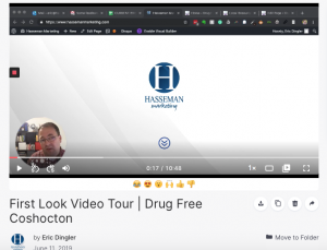
FEATURES I LIKE ABOUT LOOM TO HELP WORK REMOTELY
- It’s FREE for most.
- People can comment on the video itself.
- The videos are stored on their server saving you money and resources.
- Ease of setup and use.
2. Zoom
While Loom is one-way video, Zoom is two-way and conference video. With Zoom, you can easily setup a meeting, get a link to use to invite the person or people to your meeting, and then you can easily connect online. The video and audio quality has always been great for me.
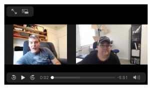
FEATURES I LIKE ABOUT ZOOM TO HELP WORK REMOTELY
- It starts out FREE, and for most people will work that way forever. For those that need to pay, the price is very reasonable.
- The ability to record the video.
- The ability to share a screen is very easy.
- The ability to mute and unmute guests as the meeting host.
- Easily send invites integrated with your calendar.
- Really good mobile app.
3. Tawk.To
While free to use, this tool does require some technical “know-how” to set it up on your website or you can use a website designer or developer. Tawk.To is a free web chat tool for most websites. I’m sure you have been on a website that has that little box in the lower right hand corner that let’s you chat with someone live. Well, that’s what Tawk.To is. In fact, during the month of March and April 2020 we offering to instal and setup this tool for only $250 to help business owners who find themselves for the first time more reliant on their websites to communicate with their customers.
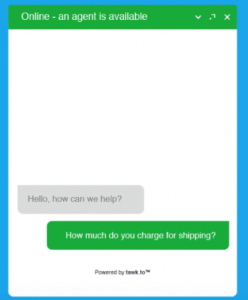
FEATURES I LIKE ABOUT TAWK.TO TO HELP WORK REMOTELY
- It’s FREE.
- It’s easy to use.
- You can have others on your team help field questions.
- You can build a repository of Frequently Asked Questions to help get your customers answers to their questions even faster.
- Hire agents starting at $1/hour to help you provide better customer service.
- A really nice mobile app.
If you have questions about these tools, please feel free to reach out to us.
We can help you make your website more customer friendly during times when in-person commerce is something people are avoiding because of weather, natural disasters, or virus outbreaks. If you need to work remotely, we can help.
If you want more contact designed to educate and inspire, check out our blog page here.
by Eric Dingler
 “Eric, I’ve had my website for 5 years, is it time to do a website redesign?”
This, or some form of it, is a question we get asked from business owners who understand the value having the right website brings to their business. Some had made their own website when they were a startup entrepreneur, others have had a professionally designed website for years.
Now I think the answer we give normally catches them off guard.
In short, the answer is the good ‘ole frustrating cliche; “it depends.”
Signs It May Be Time For A Website Redesign
1. Your website focuses on you and not your audience.
If your website is all about you, your services, and/or your products; it’s time for a redesign. I’m not saying don’t highlight your services or products, but does your website help the person looking at the site see them using and benefiting from what you have?
Don’t list a product/service, demonstrate the benefit. I love the saying; “no one buys a drill, people are buying the hole the drill will make.” What is the problem your product solves? And, why does your drill make getting the hole better than another drill?
2. Your website isn’t up to date with best practices to provide an amazing user experience.
Is your phone number easy to access? Is your address located at the bottom of every page in an area known as the footer? Do you have enough contrast between colors so individuals with vision disabilities can easily read your site? Is your website designed for people who use adaptive equipment? How about security? Does your website address have “http” in front of it or does it have what it should have with “https” in front of it?
If you answered no to these questions DON’T REDESIGN YOUR WEBSITE.
Well, maybe redesign your website. Some of these common mistakes can be fixed by just updating content. If you’d like a custom audit free website audit, just click here and email me. My name is Eric, and I’m the lead web designer for Hasseman Marketing. I’ll take a look at your site and let you know if it’s compliant with the American’s With Disability Act, how it compares to websites with best practices for user experience, and I’ll show you exactly how you fix any issue on your own. I promise to never email you again with a sales email.
3. Your website isn’t ranking in search results.
When someone does a search on the internet looking to solve the problem your service or products solves, and they don’t see your website in the search results, that’s lost sales. Sales that are going to your competition. Ouch.
The hard truth about ranking in search results is this. Google doesn’t rank you, your competition does. If their website is structured for Search Engine Optimization (SEO) and your’s isn’t, They win.
Again, you may not need an entire redesign of your website, you may just need some tweaks to the content.
In fact, you can get a free audit of your site’s SEO right now with our free tool. Just enter your website’s address and email below:
4. Your website looks and feels dated.
Unless vintage is your brand, a vintage feeling website isn’t going to help you. By now, it’s just expected that a website will be responsive to different screen sizes. It’s expected that you’ll have up to date information. I mean, have you ever been on a website and they had an announcement for something that happened three years ago? If your site is not up to date, your visitors are quickly going to leave.
So, when is the last time you took a very close look at every word on every page of your website? If it’s been awhile, that’s probably your first step.
BONUS INFORMATION
What’s the benefit of a website redesign?
Simple. A new site gives you something to promote. It’s an updated tool to help you do more business or reach more people with our message. It helps you reconnect with current customers that have drifted away and helps you find new a new audience.
For example, we just did a redesign in the last couple of months of this website. The results? A 41% increase in visitors. That’s a big result that you could have for your website as well.
Again, feel free to take us up on our offer to look your site over by sending us an email here. Or, use our free SEO audit tool above for a free instant report.
by Eric Dingler
 Today I want to share with you the checklist we have developed that guides us like a roadmap during the design process of each new website we build. And now you can use this checklist to get your own perfect website.
Not every business needs to pay for a web designer. I mean, I don’t go to the doctor for every little medical thing and I don’t get the advice of an attorney before I sign every single document in my life. However, sometimes I need a doctor, sometimes I need an attorney, and sometimes you need a web designer like us. But for the times when a do-it-yourself website works, we hope this article helps.
What is the perfect website?
Before we get into the checklist, let’s define ‘the perfect website“. Website design, like graphic design, video production, or pizza topping preferences is subjective. What people think makes a website “perfect” is influenced by their age, experiences, personality, education, etc. However, there are some elements that are objective that lay a foundation to get you that perfect website.
For example, your website should:
- Be easy to read by humans, search engines, and adaptive equipment for people with disabilities.
- Load fast, people won’t wait.
- Be responsive to different screen sizes.
- Add value to the people who visit it.
The Checklist For An Objectively Perfect Website
So technically, this is going to be checklists inside of a checklist.
First, let’s explore the steps you’ll want to take to get to your finished website. Then, below, I’ll explore each of these in a bit more detail.
Table of Contents:
- Determine your website strategy.
- Develop a plan to market your website.
- Plan for your website’s setup.
- Prepare the content for your website.
- Know how you are going to maintain your website.
- Build your website.
Determine Your Website Strategy
The most important outcome in this step is to determine your primary call to action, also know in the biz as CTA, to meet your website’s goal.
If you get stuck, wrestle with this truth about websites. Every website solves a problem, even your’s. If you aren’t sure of the problem your website solves or should solve, email me and I’ll help you figure that out
Questions to determine your website’s goal.
- What do I want people to know?
- Why do I want them to know it?
- What do I want people to do?
- Why do I want them to do it?
Questions to help you determine your website’s strategic call to action based on your goal.
- What is the most valuable action every website visitor needs to take on my site for them?
- What is the most valuable action every website visitor needs to take on my site for my business?
Now, can you match these two up into one call to action? If so, that’s CTA gold!
Other factors to determine at this step.
- Who is your ideal audience? (influences look and feel)
- Where will they be when they need/visit the problem your website solves? (influences if you should design mobile or desktop first)
- How are you solving the visitors’ problem? (influences functionality and features)
Develop A Plan to Market Your New Website
This might seem strange to put your marketing plan at the top of the list like this, but it’s important to know your keyword strategy before you do anything that follows.
A keyword is a word or short phrase you are going to design your site around to help people find your website in search engines.
You can have more than one keyword. At Hasseman Marketing we are developing keyword strategies around “Video Production“, “Promotional Premiums“, “Graphic Design“, etc. So, instead of putting all of these on one page, we developed our website so each keyword has its own page. Another way to think about this might be to ask yourself, “what are the different services we offer?” Or, “what problem (or problems) are we helping people solve”.
Also, for local SEO it’s important you are consistent with your company name, address, and telephone number. Setting up your Google My Business is a great step to take here.
Additional things to consider at this stage:
- What social media platforms will you be on? (influences functionality and layout decisions for your website)
- Will you have and maintain a blog? (influences layout and functionality)
- Will your SEO strategy be local, national, worldwide, or a combination? (influences the copywriting you’ll want to do, alt tags on your images, etc)
Plan Your Website’s Setup
Now that you know what you are going to have on your website, you are almost ready to start actually building the website.
But first, there are a view things to decide, even if you are about to do a redesign of an older website.
- Domain Name. You want to get a quality and easy to remember URL for your website. The URL is the “www.thisisyoururl.com” that you will promote as your address on the internet.
- Website Hosting. This is where your website will live. You can use a drag and drop builder like WIX or Weebly, in which case they will be your host. Just make sure you check the fine print in the agreement. Sometimes they claim ownership of your content. Or, you could use a CMS (content management system) like WordPress. Which currently is over 30 percent of the internet. Even big brands use WordPress. Target, Sony, Best Buy, BBC America, Disney, Facebook Newsroom, and many many more. We use WordPress for all of our sites and the sites we build for website owners. So for hosting; if you use WordPress, Joomla, or another self-hosted CMS get a good one. We use and recommend Siteground. (just a quick note: that link there is called an affiliate link. That means if you click on it and sign up for hosting with Siteground, we make a small commission. Affiliate marketing is something you might want to research as a way to monetize your new website if that’s a goal you have.)
- Branded Email. Be professional. You’ll look better and be taken more seriously if you have an email that is [email protected] compared to using [email protected]. Most website hosting companies offer an email solution…but we have never found one we like. We use Office 365 at Hasseman Marketing, but we typically set our website owners up with GSuite by Google because it’s a bit easier to use.
- Theme. BTW, If you do use WordPress, you are most likely going to want to use a Theme. We use and recommend Divi by Elegant Themes. (This is another affiliate link like the one we explained above.) At the time of writing this post, over 570,000 websites are built on Divi. It has a robust support network, and you can find thousands of articles and YouTube videos on how to do all kinds of things in Divi. It’s the most popular premium Theme currently on WordPress right now for both do-it-yourselfers and WordPress web designers like us.
- Email List. You are more than likely going to want to gather emails to build a list. We use both Infusionsoft and Mailchimp and we love them both.
IMPORTANT SECURITY NOTE: It is best and safest if you use three different providers for your domain name, website hosting, and branded email. If you get all three at one place and just one of them get’s hacked…then the hackers have access to all three and can really hurt your business. So, use three different providers and three different password for each one. I know, all those passwords are a pain, that’s why we use LastPass.
Prepare The Content For Your Perfect Website
Based on your strategic goals, call to action, and SEO strategy you are ready to start gathering and preparing your content. We strongly recommend hiring a professional copywriter who specializes in online marketing copy. Or at least visit several top quality sites and look carefully at their language.
A couple of tips.
- Write for people first and search engines second.
- Write in a logical order using headings based on a hierarchy. If this point doesn’t make sense, it will when you start building your site. You will have several options for headings. H1, H2, H3, etc. I remember the first couple of websites I built for fun. I thought these just helped me present titles in different formats. So, I would style the H1 and the H2 to look almost the same, except have a different color maybe. Then I learned I was doing it all wrong. The H1, H2, H3, etc helps search engines and screen readers make sense of your website. What you can’t see as you are reading this post is the HTML code that computers can see. The title of this post is “wrapped” in H1 tags. The next subheading is inside H2 tags and then I have an H3 tag, and back to an H2 tag. Think back to writing outlines in school. This is the same idea. Now, these title tags are important in helping search engines see what your content is about but most importantly, it shows the search engine you have thought of the visitor experience.
- USER EXPERIENCE IS QUEEN. Content is King, but the experience of your website users, known as UE or UI in the biz, is queen as it relates to ranking in search engines. BTW, why is ranking important? How many times have you scrolled to the 4th page in Google to find a car mechanic? The ranking of your site is vital if you want to spend less money to get more visitors so you can make more money in the long run of your business.
- Think accessibility. Keep in mind that there are hundreds of thousands of people on the internet with disabilities that deserve to be able to access your website.
- Use common language. If you must use an acronym, explain it. Just because I know what WYSWYG means, What You See Is What You Get, doesn’t mean everyone else in the world does.
- Rename your images before you upload them. Name your pictures with names that tell people what the image, or at least what the page the image is on, is all about. Make sure here you add the “alt description”. That’s an option you will see when you are building your website. It’s found in different places, and its critical for screen readers and search engines. Seriously, this is probably the biggest place do-it-yourselfers miss out on adding a super easy way for people to find your content. If you have a pizza shop in Coshocton. Name every picture a little bit different along these lines. “Best pizza in Coshocton” “This is our award-winning pizza in Coshocton” “Get a Pepsi delivered with your pizza anywhere in Coshocton”. Honestly, if you do this, it won’t be long before your pizza shop is the first result in Google anytime someone searches for “pizza in Coshocton.”
- Resize your images before you upload them into your new perfect website. (notice how I used my keywords “new perfect website” there…and then I did it again here, that’s just a little SEO for ya). Your pictures don’t need to be more than about 1500px wide. And should definitely be under 200 kb in size. If you need help with this, check out this website where you can resize images for free.
Know How You Are Going To Maintain A Perfect Website
Your website will need TLC after it’s built. After all, there is no denying it, the number of people who hack into websites for fun is on the rise. And your website will be a target one day for a hack. Preventative maintenance is the key. Or as grandma always said, “an ounce of prevention is worth a pound of cure.” I mean, my grandma didn’t say it, but maybe yours did.
- Start with good quality hosting. Again, we strongly recommend Siteground.
- Use strong passwords and change them every so often.
- Update your theme and plugins. Now, this may only apply to WordPress. I don’t use other website content management systems (CMS), so I can’t speak into them. But in WordPress, you should update your theme, plugins, and WordPress itself weekly. PRO TIP: Wait at least 24 hours after an update is available before you install it. Sometimes an update can break your site. Let others find out before you do. Also, Tuesdays seem to be the best day to updates.
- Use plugins and third-party security services. Just Google option for the platform you are building your site on, and you will find what you need.
- Once a year at least run a security check on your site. We use Sucuri
Build Your Website
Now that you have your plan in place, it’s ready to give life to your new website.
While building your site, keep referring back to your strategy and marketing plan to ensure you aren’t drifting.
Since you may be using any number of Content Management Systems like; WordPress, WIX, Joomla, or Drupal we are going to close this post here. Building a website on these different CMS’s is going to be unique to that system. And the point of this blog post isn’t to teach you step-by-step how to build a website, but what it takes to get the perfect website…objectively of course.
Never miss an update, sign up for our VIP newsletter here.
by Eric Dingler
 One of the first three questions asked when it comes to a new website is, “how much does it cost to build a new website?”. The other two questions, by the way, “how long does it take?” and “do you have any websites you have built I can see?“.
Four Pricing Options
First, there are a couple of pricing systems out there when it comes to how much an agency like Hasseman Marketing charges for websites:
- Package Pricing – This is when a web designer will display the cost of a new site based on predetermined restrictions. For example, “5 pages for $1,500″.
- Custom Quote – This is when a web designer will work with you to discover what your websites end user will actually need and experience on your website. Together you and your web designer will determine all the unique functionality your site needs for your business model to succeed online. Then the designer can give you a quote that ensures you aren’t paying for things you don’t need and to make sure you don’t hear, “sorry, that’s not an option in the package you selected.” This is the approach we take at Hasseman Marketing.
- Renting – This option isn’t nearly as popular as the two above but it is out there. Let’s say you install swimming pools. Now, let’s say you decide all you want from your site is for it to generate leads. In this situation, you can pay rent to have a website that has been built and optimized to rank for “Swimming pool installers in my area“. The website’s actual owner promises to keep the website up and running and attracting new leads that they will pass on to you. As long as you pay rent, the site keeps sending you leads. Stop paying rent, and the leads go to another pool installation professional in your city. These websites generally have URLs (website names) like “www.poolsinakronohio.com“
- DIY – A fourth option is to go straight up do it yourself. And, if you have the time, this can be a totally doable option if you need a very simple site and aren’t trying to compete for the attention of people on the internet. You can find a good article here on how much a DIY WordPress website might cost you.
How Much Is A Custom Quote Website Going To Cost?
Regardless if this is a new website or a redesign of a website, the quick answer is at least $1,500. If your site is an e-commerce site, you are looking at a starting price of around $5,000. But, don’t be surprised when you see these numbers go up to $5,000, $12,000, or even $25,000.
Here’s why.
Several years ago my wife and I built a new house. We had a design consultation with a custom home builder. We settled on a floorplan that had a starting price tag of around $120,000. After making a few adjustments, upgrading the appliances, adding a second bay onto the garage, and adding a row of block to the basement so we would have higher ceiling to make future basement finishing nicer, our $120,000 house was suddenly $250,000. Needless to say, we changed a couple of things back to spec to get back closer to our budget.
Building a website isn’t much different than building a house. Instead of using lumber and materials, a website uses code and software.
A basic website might be $1,500. But, let’s say you want a calendar on your website. No worries, just a few things to consider.
- How often is the calendar getting updated?
- Who is updating it?
- Where are they updating from?
- Does it need to have the abiity for website visitors to be able to sync, download, or print it?
- How do you make it match the look of the website design?
Now, depending on the answer you might be able to use a plug-and-play calendar that takes no extra code writing or configuration. Or your new calendar might require 3 hours of work to generate the right code. In a package price situation, you are going to get no calendar or a basic calendar that probably doesn’t do what you want it. In a custom quote website project, you’ll get the perfect calendar.
Building Doesn’t Make A Website Ready For The World
The other things to consider is the fact that a house isn’t ready to live in once it’s been built. It needs to be connected to water, sewer, electric, and more. The same idea is true with a website. Once it’s built, it really should be connected to Google My Business, Google Analytics, Google Search Console, and more.
To get started on a custom quote for your website, talk to your Hasseman Marketing rep or drop us an email today.


 “Eric, I’ve had my website for 5 years, is it time to do a website redesign?”
 Today I want to share with you the checklist we have developed that guides us like a roadmap during the design process of each
  One of the first three questions asked when it comes to a new website is, “how much does it cost to build a new website?”. The other two questions, by the way, “how long does it take?” and “do you have any websites you have built I can see?“.